Office Santos
Graphic design, Illustration. Lisbon, PT.
Graphic design, Illustration. Lisbon, PT.
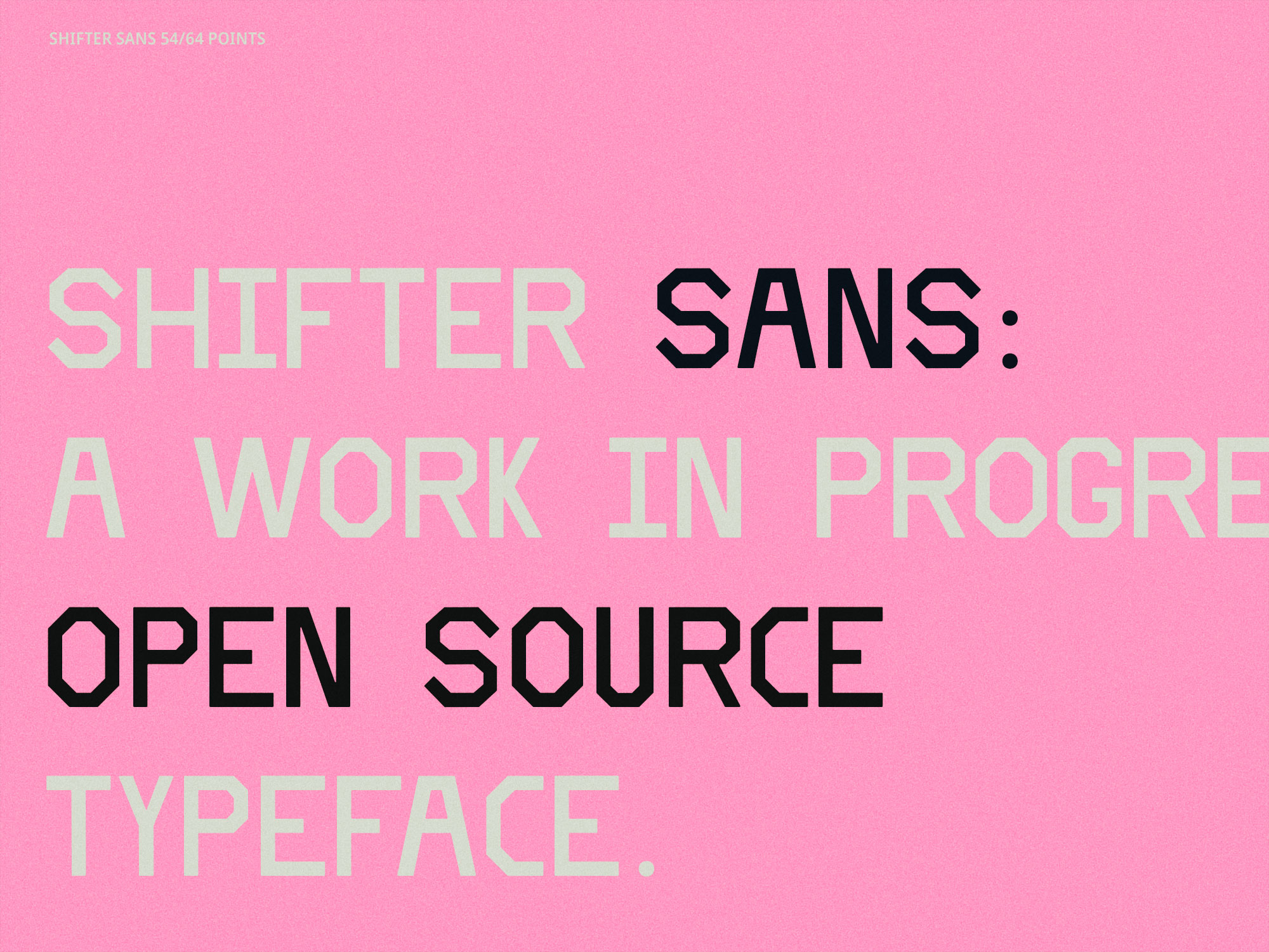
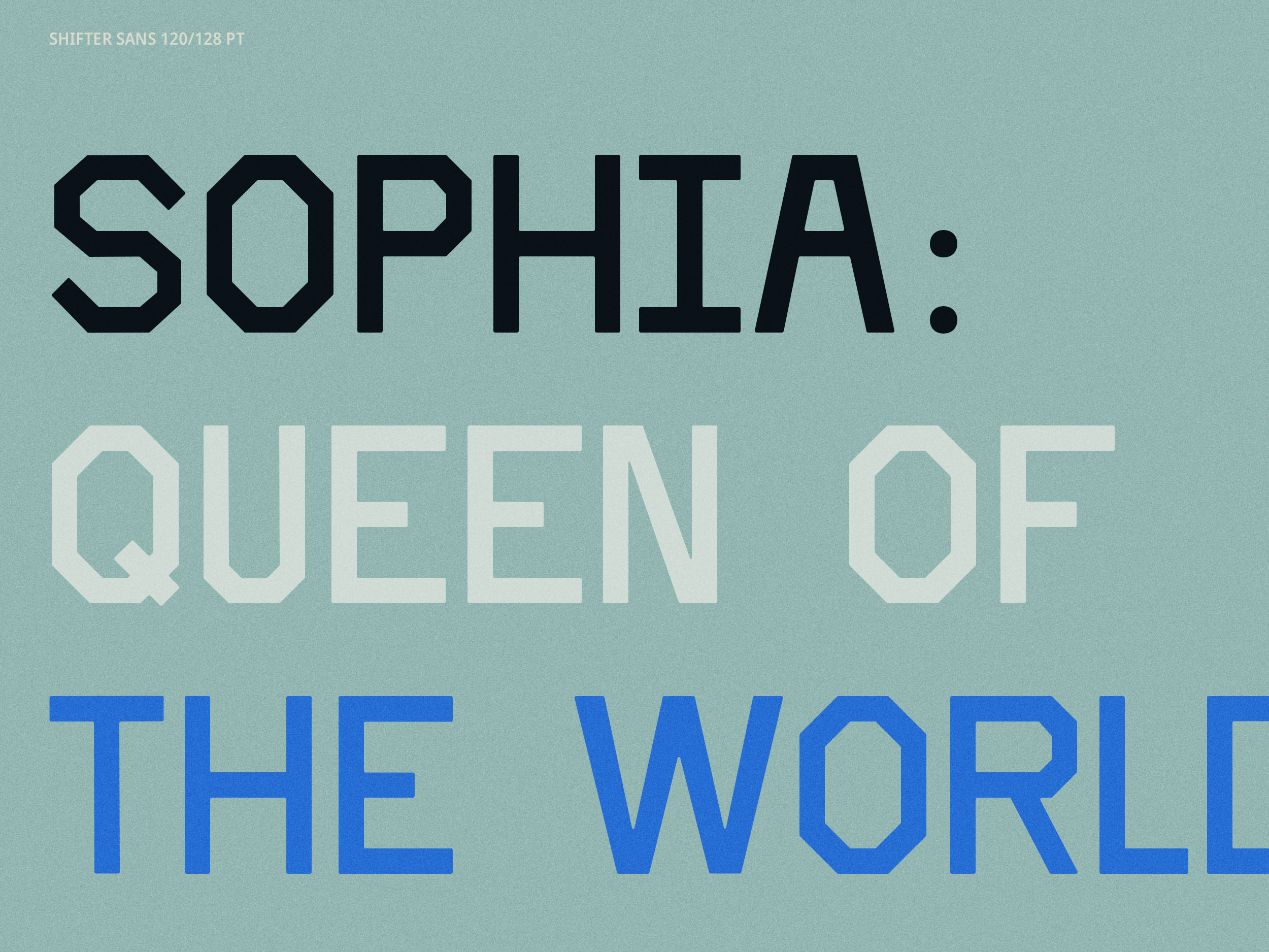
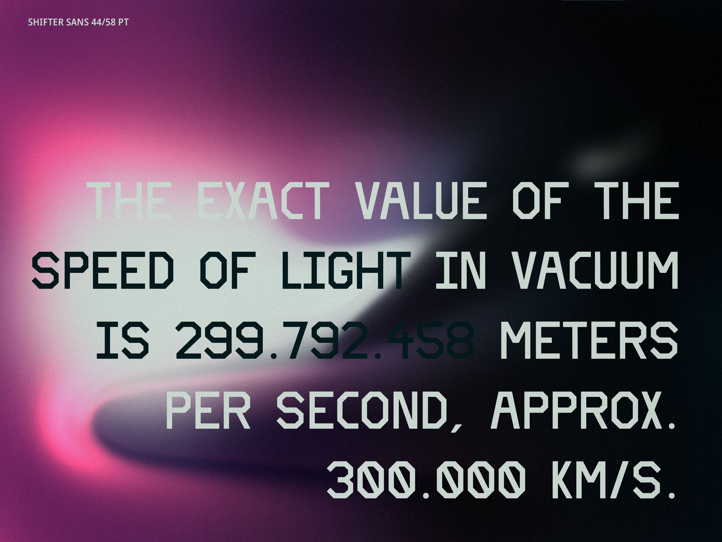
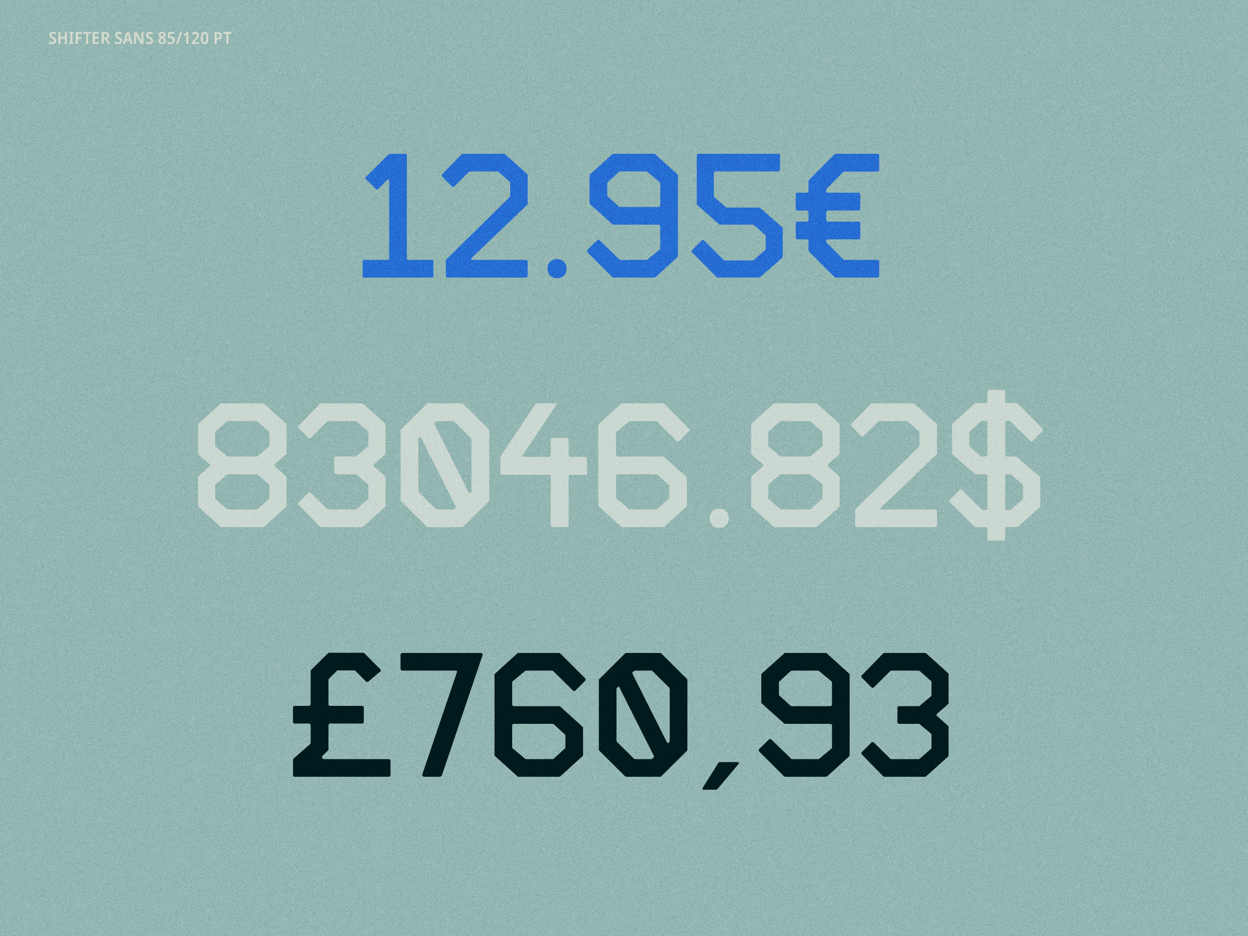
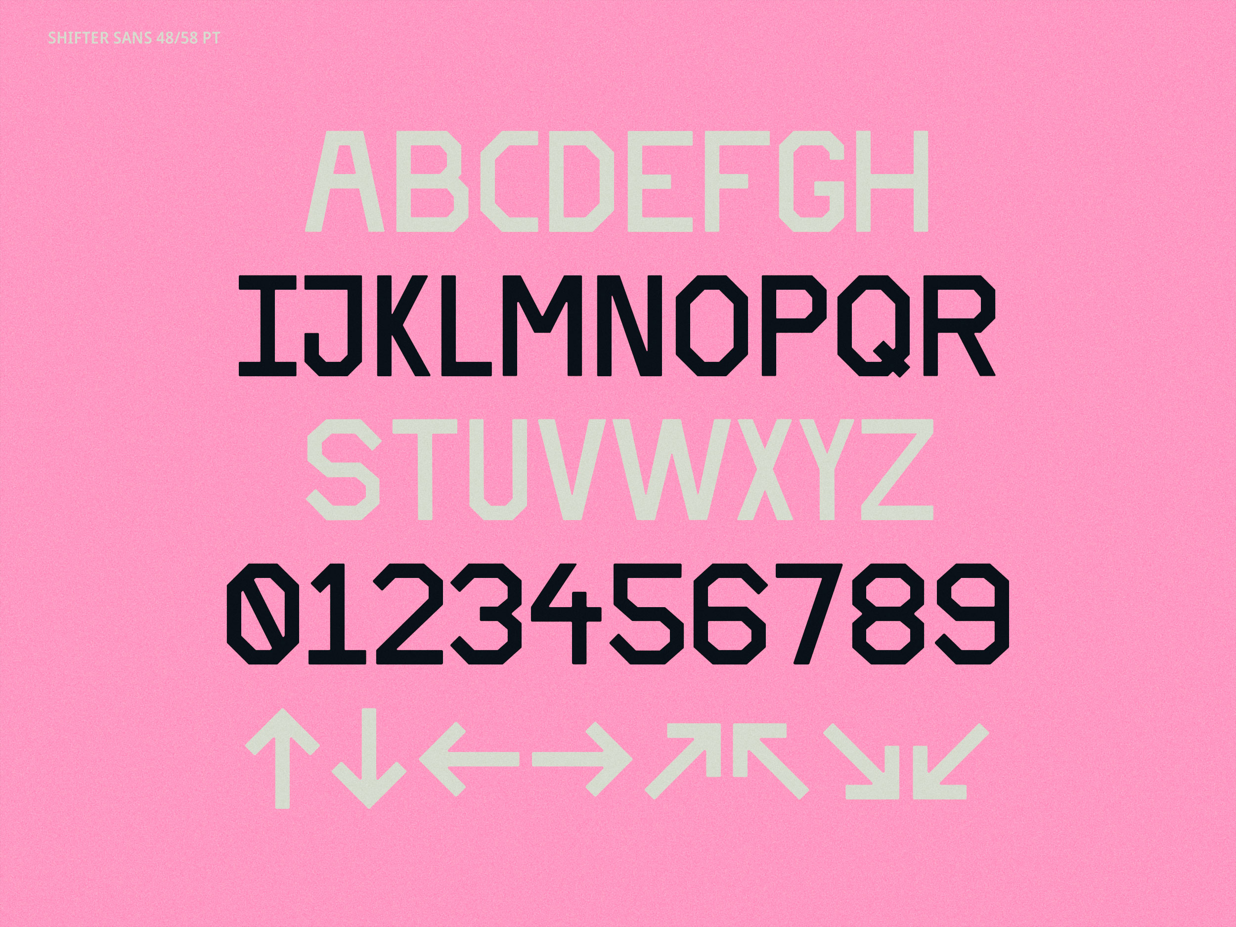
Shifter Sans is an open-source display typeface that was designed as one of the cornerstones of the rebranding effort by Portuguese independent media studio Shifter. The typeface was conceived as both vehicle and symbol for how Shifter defines itself: cooperative, creative, independent. The new Shifter logo is also set in Shifter Sans. The project was art directed by João Ribeiro and Daniel Hoesen. It was released under a SIL Open Font License.
«The idea for this typeface is simple. We wanted to transmit Shifter’s experimental spirit by designing a simple, 45º and 90º angle typeface that allows anyone to understand it’s own internal logic. Shifter Sans does not pretend to have the appearance of a refined product; it holds the words that define the brand with attitude, rigor and clarity, while always leaving the door open for criticism and interaction.»1


© 2025 Office Santos.
All Rights Reserved.